compaign analyse
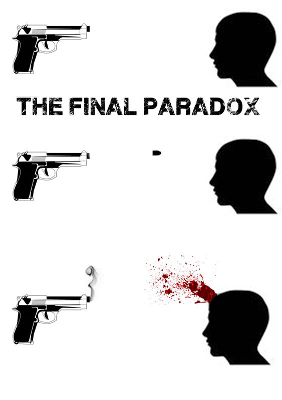
To two types of advertising are the poster and the website. The poster has on it a silhouette of a man, the gun and the bullet and the text it in black and white. This is to keep the poster simple. The only colour on the poster is the red in the blood and the grey in the smoke. The red blood stands out more now from having the black and white. It is also based on one of the screens in the thriller where one of the minor characters is killed off. The website layout has on it the poster that has been made. The background of the website is black and this to be simple like the poster. It has an inverted silhouetted gun and bullets. Underneath is the box and the note next to it with bullet with the characters names on them. This is the home page and there is the outtakes that has the behind the scenes in it. There are also the charters bit that has the background information on them that you might not find out about in the film. There is also some script extract that was used in the film. There is also writing on the note that is meant to look like the one from the film. The reason for using this is it has some of the main props and scenes from the thriller. The poster contains the head shot scene and this is one that is memorable. The web site has one of the guns with the bullets that had the names of the charters on it and the box that has the note with that was use in the thriller with what it would have said. The other taps would have the behind the scenes things like the outtakes that will have the behind the scenes and then the outtakes from the filming. The reason that it is simple is so you can read the information and are not dictated from the other pictures and you can see the information that you need like the title. The website is simple so you can read the web site and know what tab you are on. It also helps you know what you are looking at. It also make it clear to read and take in the information. The font that is use because it is very clear to read with some of the letters distorted but not so you can not understand the letters. The other font on the website is more of a fancy but still readable. This shows that a higher class of character has written this. It is also on the bullets and is meant to look like it has been engraved. The writing on the gun is a referents to the box used in the film. The blank space on the note that is under “on this day” there would be a date that will change to the day ahead of the day you look at it. The note has the font on it to look like it has been hand written from the character. The colours on the poster are use so the blood red stands out from the head and the gun. It is also like this to draw your eye towards the blood. The colour on the poster doesn’t reveal what the thriller could be about. The web site has the black background so the other colours stand out and the white on the text stands out as well. It also shows that that it will be quite dark from the use of the dark colours. It also helps the white bullets stand out and the text on them as well.