
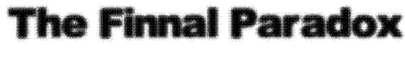
This is one of the ideas because of the ruffed look and the buildings that are at the bottom of the text could show the location of the thriller in a city. It also gives it an urban feel to it. It has been also made to look like it has been made with stencils.

This texts looks like it has been made with a paint brush and then painted on a wall like graffiti. The give the feeling like it is on a back ally or a part of the town that is not used be every one that lives there. It is very clear and you can easily read it.

This font has the letters on it that look like they are from a ransom note. This gives the effect that it could have been in the box or that is the characters in the thriller use the note to get things that they need. It also shows that some of the characters are not the most friendly of people.
This font is very fussy and looks like powder. This idea for this fount is to be on a poster with the white powder in the thriller. It is very clear and easy to read and has not disfigured any of the letters so it is very clear.

This font is very easy to read and the letters are eroded so they have a worn look about them. This gives the effect that they are in an urban area and have been there for a long time. This gives it a rougher look and it has no distortion on the letters so it is easy to read.

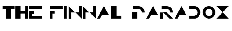
This font is very distorted and this gives the element of mystery and intrigue into why the font is that way. The distortion on the letter is not so bad from the fact you can still work out what the letters are and then you can read them. It is the most different font to the other ones from the fact that is looks so different but still readable.